MATCH POINTE
BRANDING / VISUAL IDENTITYMISSION:
To empower women and girls in sports by providing a supportive community that promotes wellness and connection.
SOLUTION:
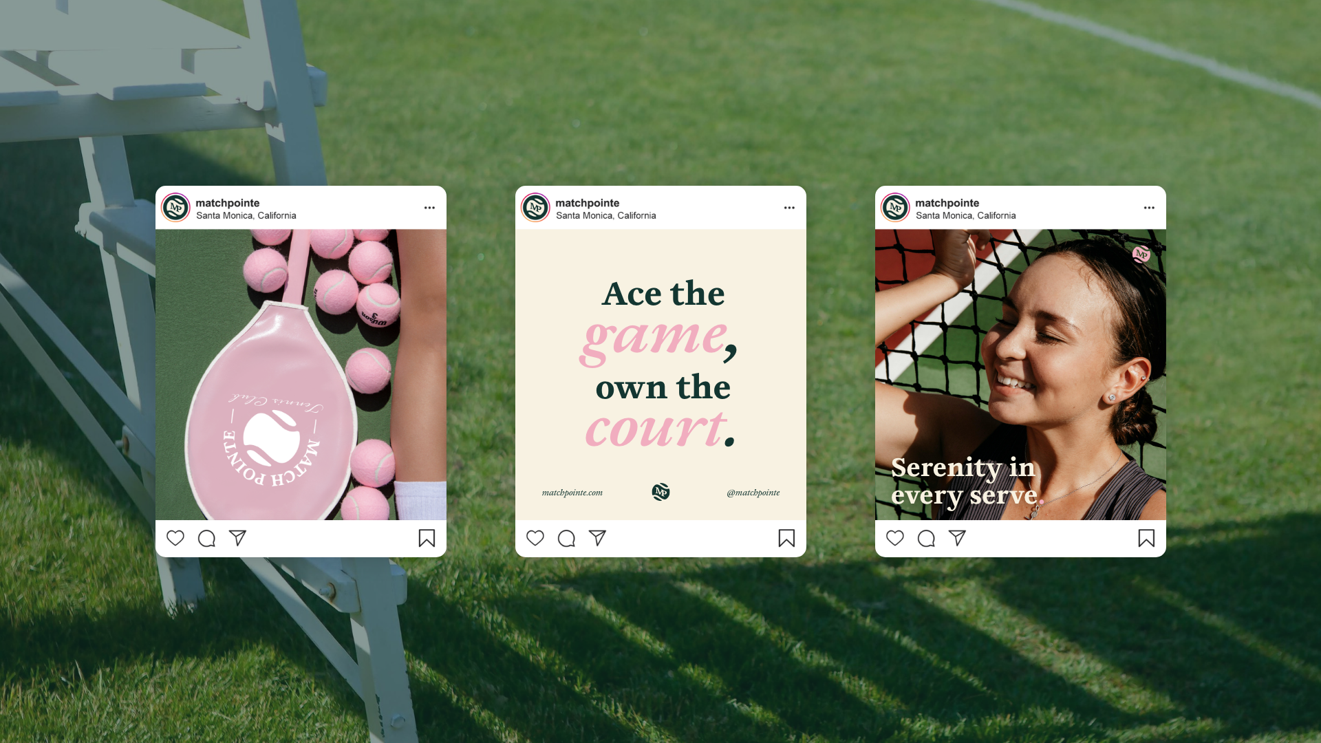
A chic, nature-inspired tennis club that offers a serene space where members can thrive both on and off the court.
INSPIRATION:
The name reflects the blend of strength and grace in tennis, capturing the club's elegant, empowering atmosphere inspired by athleticism and style.
Match Pointe is a refined, women-centric tennis club designed to offer a sanctuary for sport and style. Nestled within lush greenery and magnolia trees, the club provides an elegant space where members can elevate their tennis game, connect with like-minded women, and enjoy a serene environment. The branding reflects the harmony between power and grace, blending soft blush pinks with rich greens to evoke both femininity and vitality. With a focus on community, wellness, and empowerment, Match Pointe offers more than just a place to play tennis—it's a lifestyle destination for women who seek elegance, balance, and inspiration in every serve.
PROCESS:
Research, competitive analysis, ideation, prototyping, testing, evaluation
TOOLS:
Adobe Illustrator, Adobe Photoshop, Adobe XD


