CULTURE SHACK
BRANDING / VISUAL IDENTITY / APP UI DESIGNMISSION:
To promote sustainable travel with a reduced environmental impact.
SOLUTION:
A new hostel app offering international eco-friendly accommodation.
INSPIRATION:
Interest in eco-tourism and a desire to transform the perception of hostels.
As the global interest in sustainable travel grows, there exists a significant gap in the market for a comprehensive solution that aligns with the principles of eco-tourism. Current accommodation options lack a dedicated platform for environmentally conscious travellers seeking international eco-friendly hostels. The absence of such a service hinders the promotion of sustainable travel practices and fails to meet the evolving needs of individuals who prioritise minimising their environmental impact during their journeys.
This project aims to address this gap by developing a new hostel app that not only facilitates convenient booking but also promotes eco-friendly accommodations, contributing to a positive transformation in the perception of hostels and fostering sustainable travel habits.
PROCESS:
Research, competitive analysis, ideation, prototyping, testing, evaluation
TOOLS:
Figma, Adobe XD, Adobe Illustrator, Adobe Photoshop, Adobe After Effects
APP DEMO
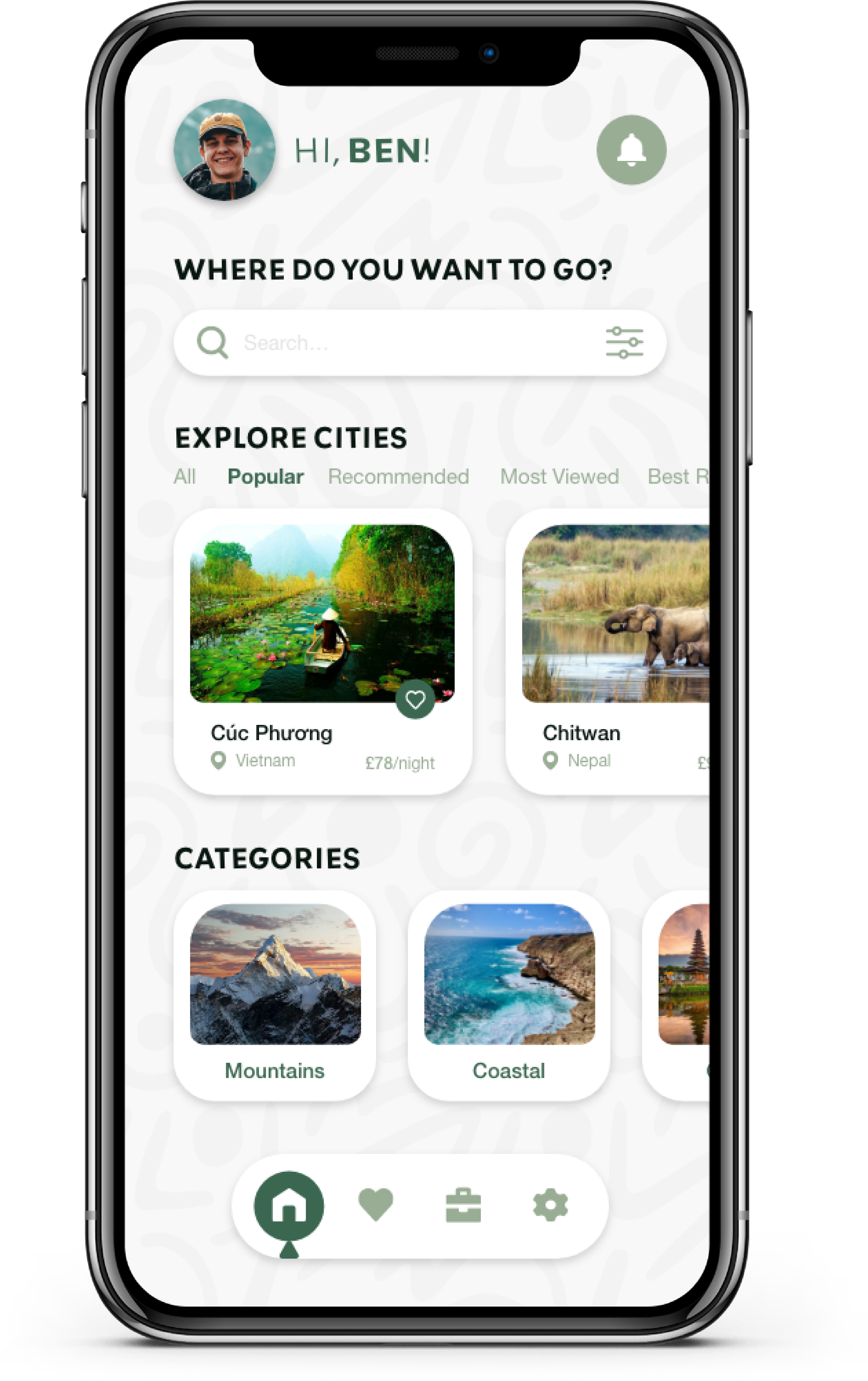
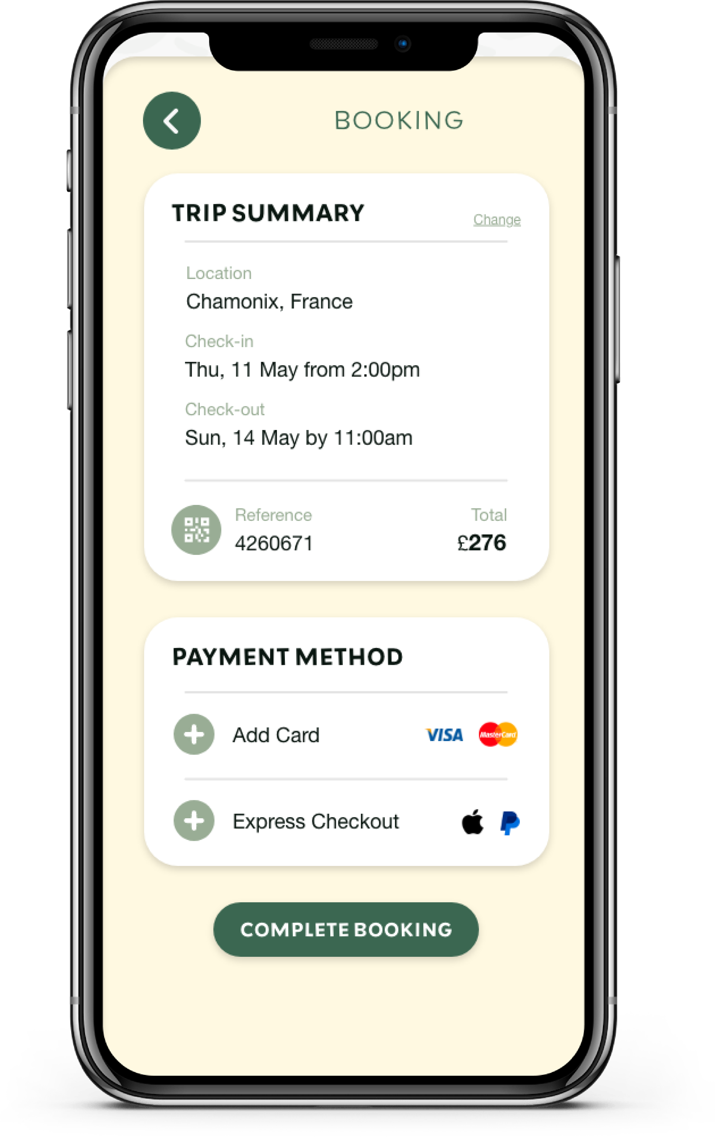
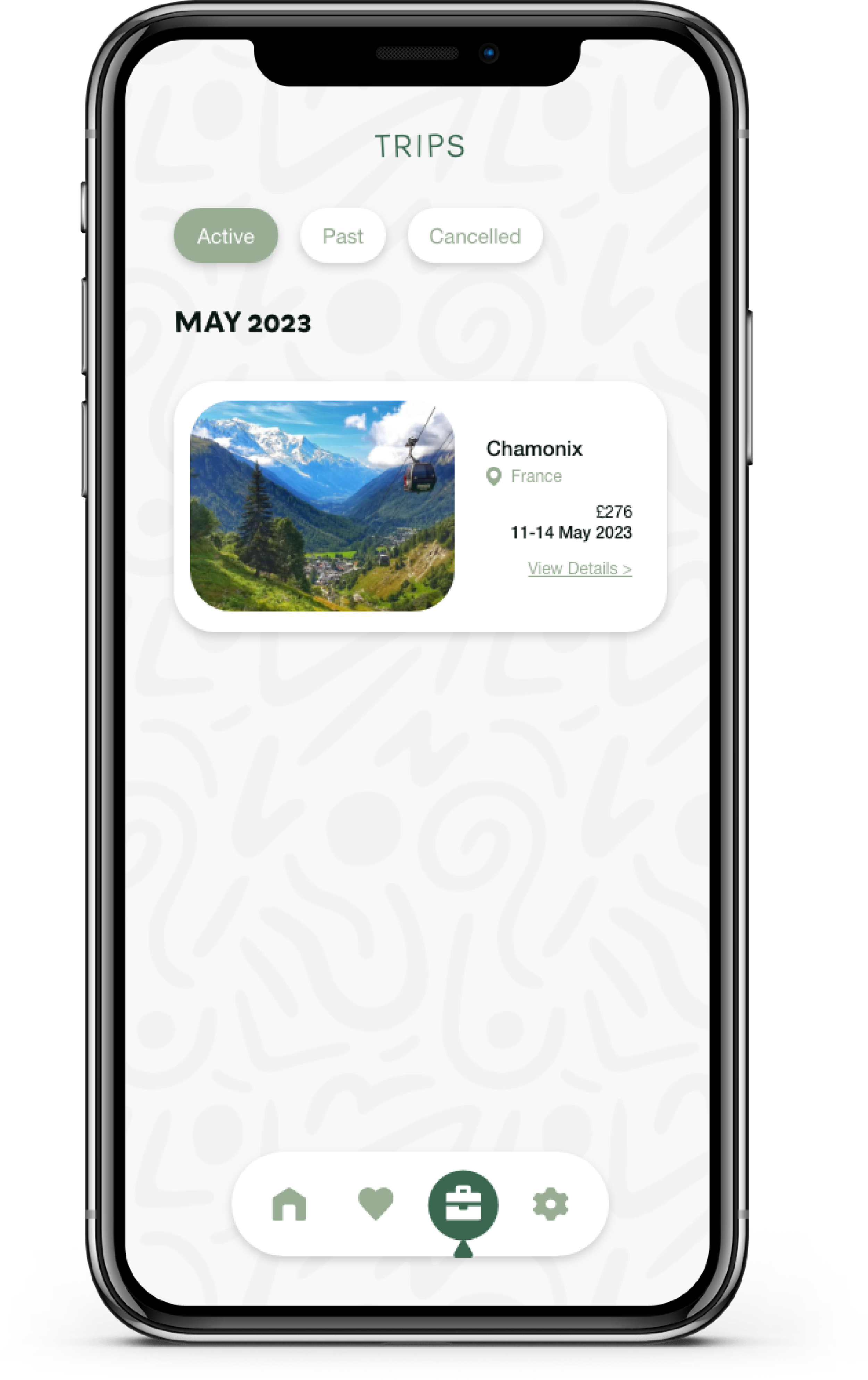
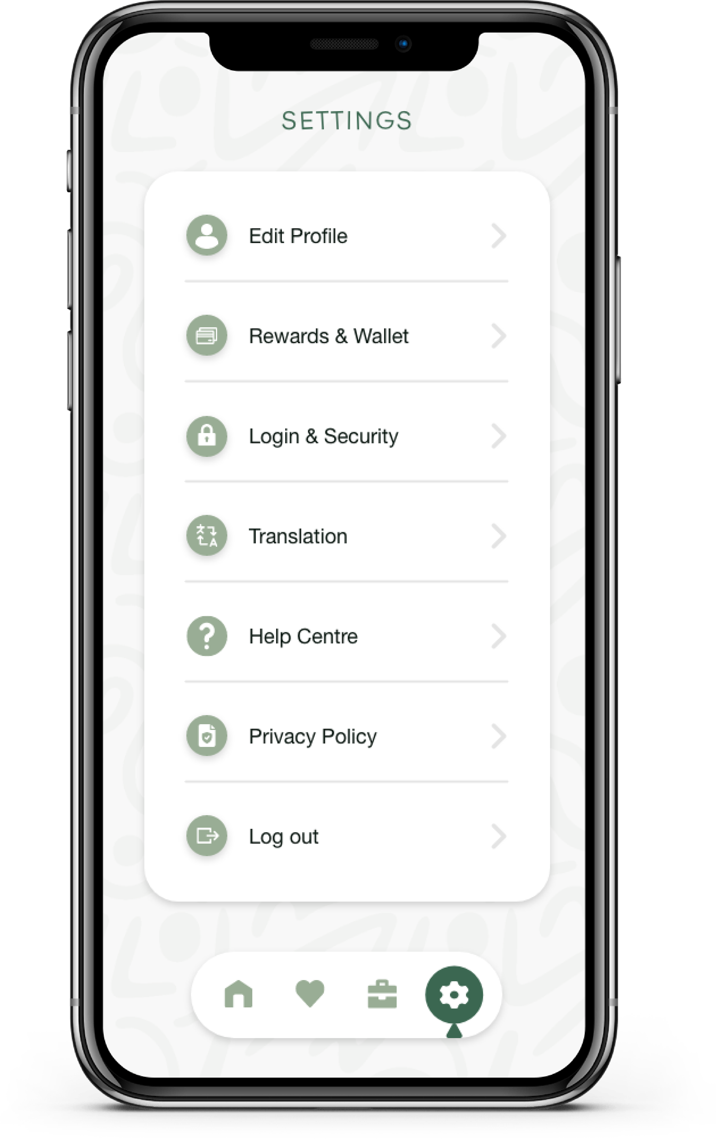
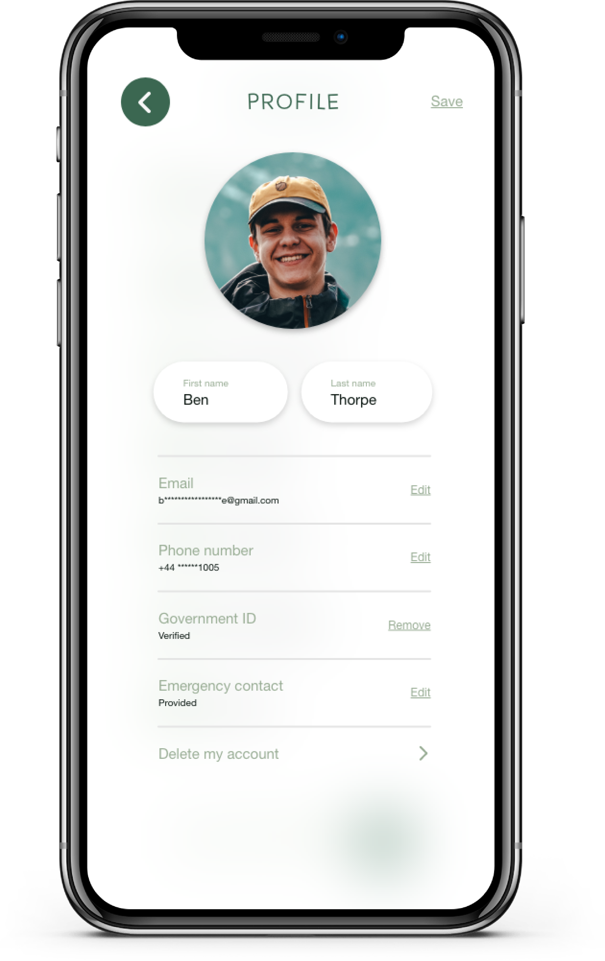
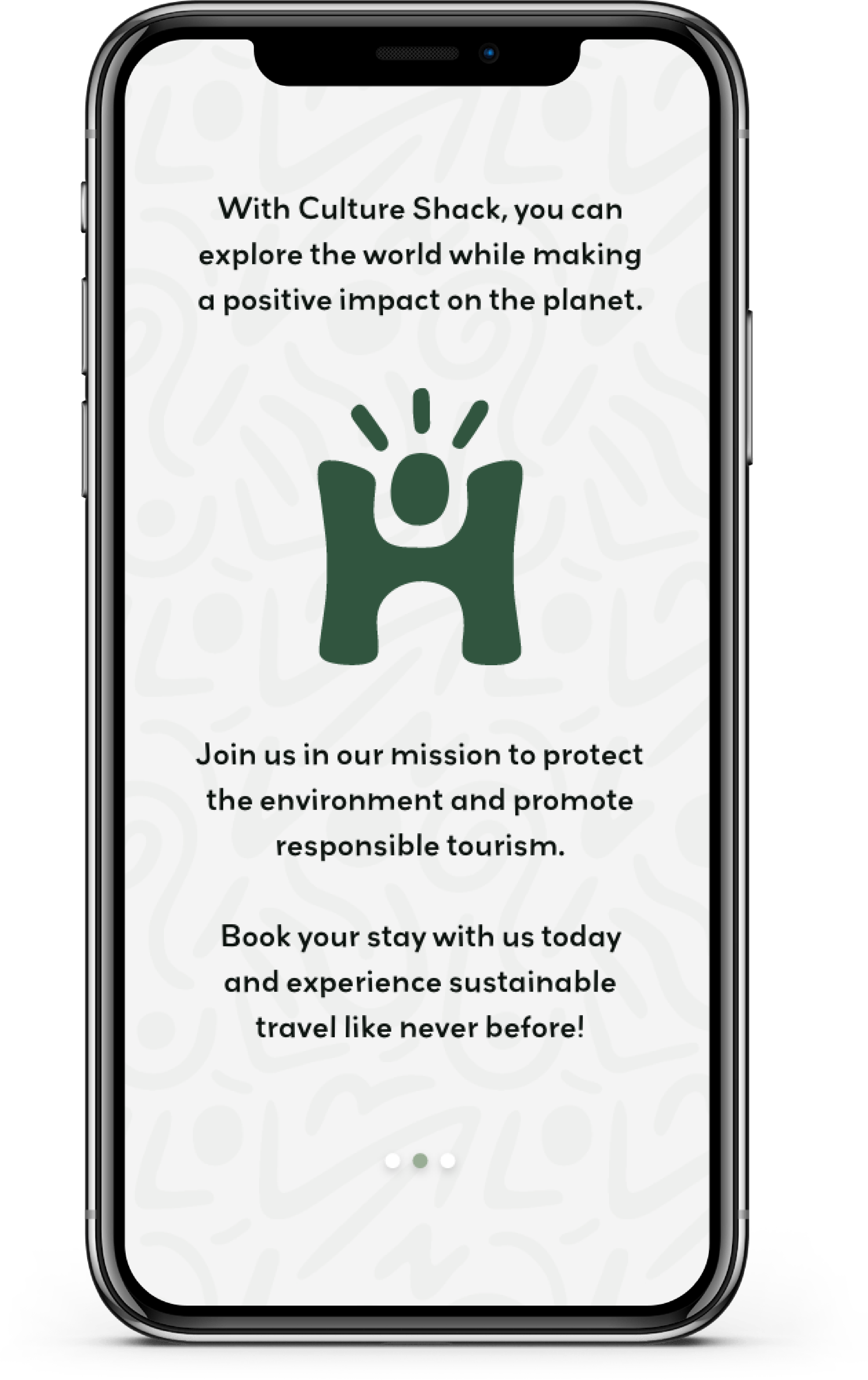
In this video, I walk through the main features of the app, covering the exploration and sorting of various hostels, reserving a room, the payment procedure, and the straightforward onboarding experience.
The app is designed to offer users a seamless experience in discovering and reserving accommodations that resonate with their preferences.
From charming eco-lodges tucked away in scenic mountains to beachfront hostels committed to minimising plastic waste, the app presents a diverse array of choices to cater to the unique needs of every traveler.
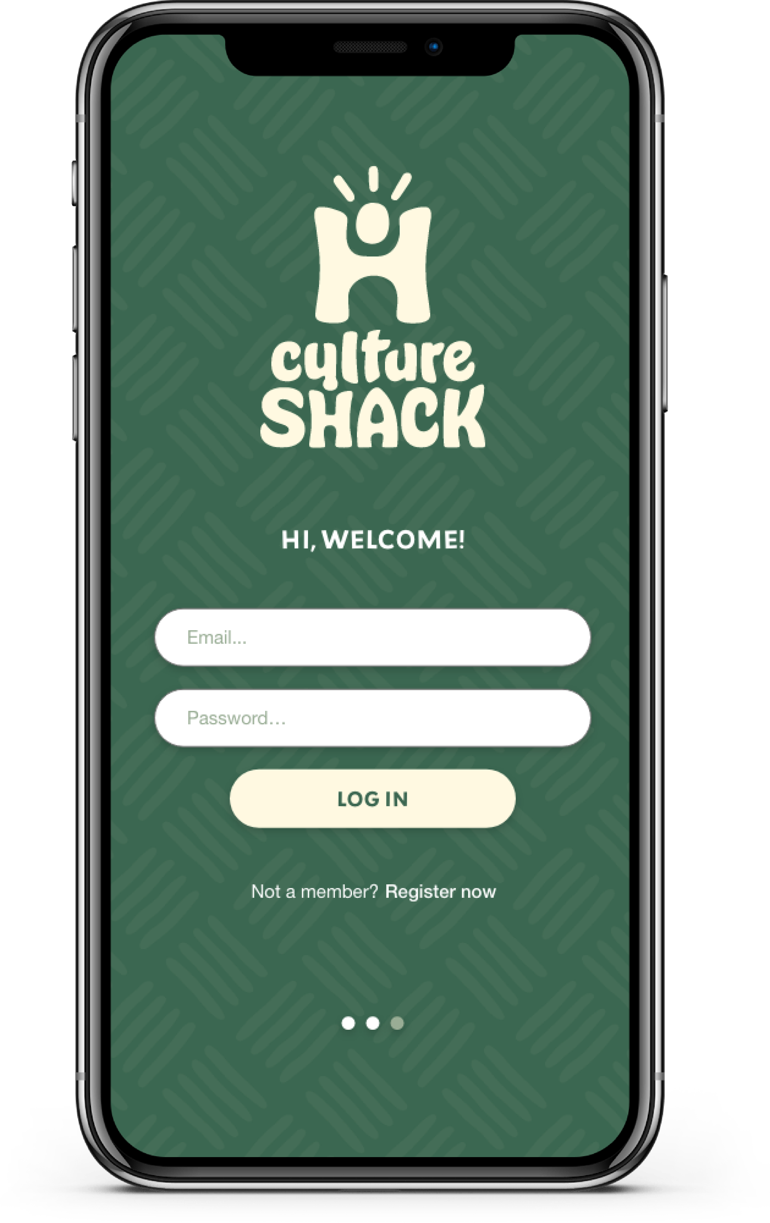
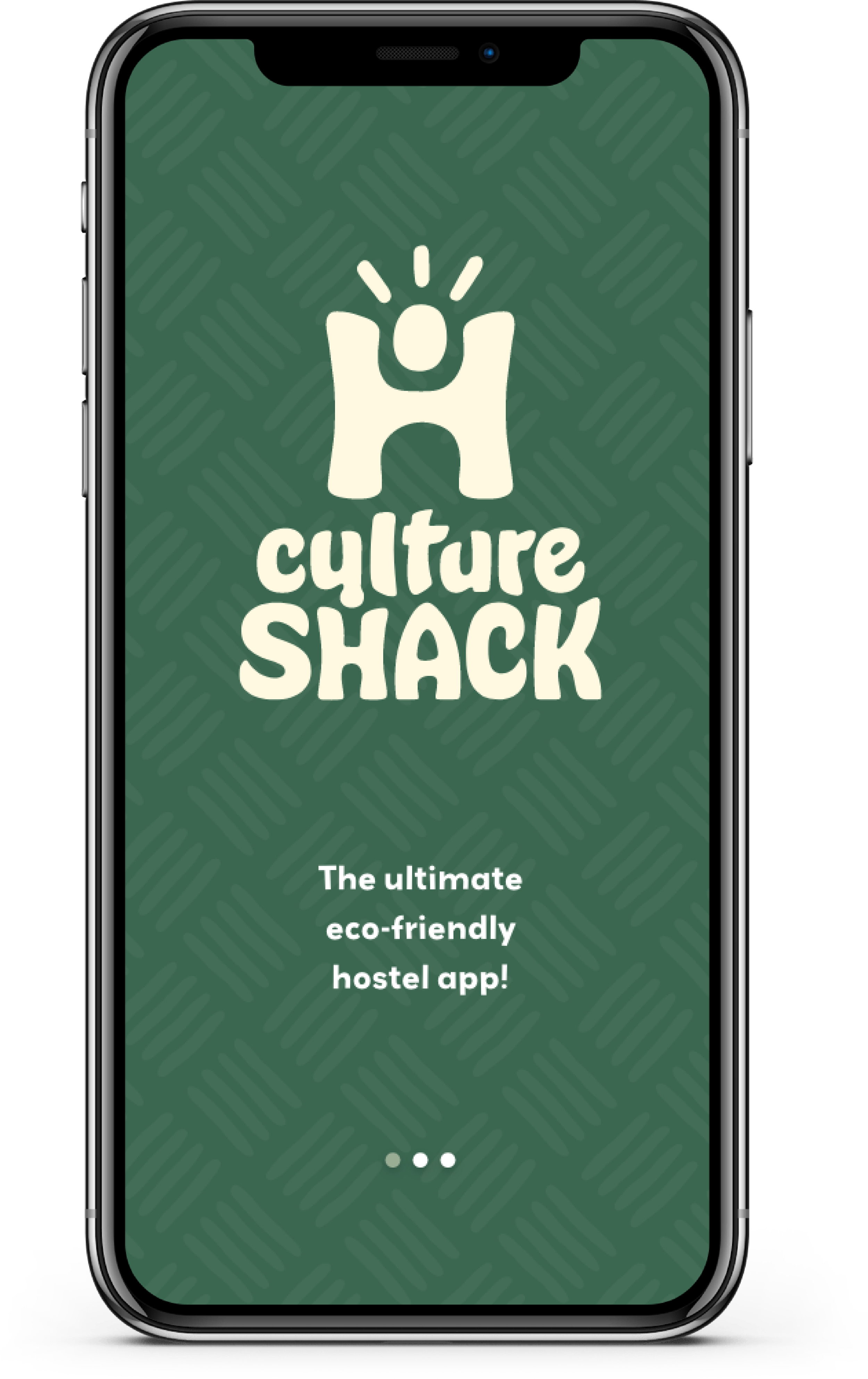
The favicon incorporates the letter H which not only represents the first letter of the word Hostels, but also doubles as a visual cue for the brand. Additionally, when the logo is animated, the letter H is elongated to resemble a bed, further reinforcing the brand’s identity.
The favicon also features a circle positioned between the letter H, which is designed to emulate the shape of a head, while the letters serve as the body. The intended effect is to represent a human figure in its entirety.
